Check out my Thinglink interactive image here:
https://www.thinglink.com/scene/995482724074520579
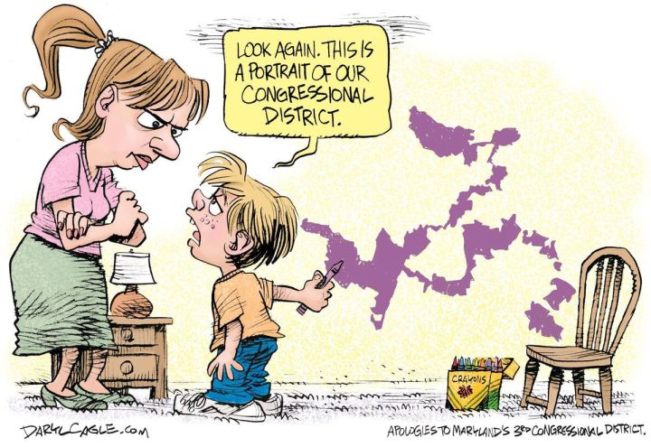
During this semester I have focused on the topic of political parties and how they have evolved over time. I have covered how the Republican party evolved into the major conservative party and how the Democratic party has evolved into the major liberal party. My focus has revolved around the Executive Branch for much of my analysis. For blog 4 I wanted to shift the focus from the Executive Branch onto the Legislative Branch. As students enter 9th grade they have little understanding of politics and the structure of government. As part of my job, I introduce a lot of concepts that can be very difficult for students to understand. Gerrymandering is a topic that a lot of students struggle with. The idea of districts and boundaries seems out of reach for many of my students. Visually representing gerrymandering through Thinglink with an interactive image allows students to better understand the material while also providing tools for deeper understanding.
I begin my interactive image with a context for learning. Bubble 1 allows students to comprehend and understand the image before them. I explain that each image represents a set of voters in each full square and that each square is divided up into districts. The imagery allows for students to understand that congressional districts contain people from both political parties while still maintaining a certain majority and minority. Image 1 shows students the breakdown of how the population votes. The 2nd and 3rd image shows how gerrymandering can disproportionally shift power towards a certain political group. Image 2 displays how all of the districts go to blue even though 40% of the squares are red. Image 3 allows for students to see how the majority of districts go to red and how blue ends up as the minority even though blue has a 60% majority. The images are strong tools for students who prefer visual aids. When first learning about gerrymandering in high school I struggled with the concept of how districts were meticulously divided up. Seeing a visualization allows for comprehension of a topic that can be somewhat tricky for students to understand. In bubble 2 and 3 I define and explain how gerrymandering occurs by providing a definition and context for how gerrymandering is carried out. I explain how gerrymandering is designed to favor one political party over another and how it weakens democracy. I also explain how districts are divided up using the national census data that is collected every Ten years. Bubbles 1 through 3 allow the students to gain an understanding of what gerrymandering is before exploring the bubbles in Image 2 and 3.
Image 2 and Image 3 explain through visualization and media aids how gerrymandering impacts democracy. Image 2 allows students to see how a majority can take over an entire area (state) without taking into the consideration the concerns of people who voted for the minority party. Image 3 on the other hand allows students to understand how the minority can actually become the majority by squandering the votes through cracking and packing of district lines. The video aid found in Image 2 created by New World gives students an in-depth look at gerrymandering while providing real life examples. Image 3 contains the New York Times article The New Front in the Gerrymandering Wars: Democracy vs. Math which provides students with an in depth look at gerrymandering in state of Wisconsin while also providing examples of how gerrymandering can be eliminated.
Creating a visualization of how gerrymandering impacts democracy absolutely allowed me to gain a better understanding of how gerrymandering impacts democracy. Thinglink allowed me to better organize and present the information that I will be teaching to students. Being able to visually layout the material allowed me to develop strategies that I can use to better teach my students. Originally when I learned about gerrymandering in high school and college teachers would rely on drawings that they drew on the board. Thinglink is far more superior tool for students to use. Creating a Thinglink allows the student to learn with a sense of curiosity that a board drawing cannot garner. Having the images, video clip, and article at hand allows for students to learn more interactively with the material. Creating an interactive tool allowed for me to gain a better understanding of gerrymandering. Having interactive tools available in the classroom is a great way to ensure curiosity, collaboration, and comprehension.
Sources:
Bazelon, E. (2017, August 29). The New Front in the Gerrymandering Wars: Democracy vs. Math. Retrieved December 08, 2017, from https://www.nytimes.com/2017/08/29/magazine/the-new-front-in-the-gerrymandering-wars-democracy-vs-math.html
Spakovsky, H. V. (2017, November 16). Von Spakovsky: Playing politics is not unconstitutional. Retrieved December 08, 2017, from https://www.jsonline.com/story/opinion/contributors/2017/11/16/gerrymandering-playing-politics-not-unconstitutional/870434001/
T. (2015, May 11). What Is Gerrymandering? Retrieved December 08, 2017, from https://www.youtube.com/watch?time_continue=1&v=1qDCGTlF0r0
Remy, R. C. (2010). Civics today: citizenship, economics, & you. Columbus, OH: Glencoe/McGraw-Hill.

Dakota,
I think this was a great subtopic to do your visualization on. Our state is at the front of this issue, I wonder if you could reference that somehow if you were doing this again. I really like the way you used your experience as a student to inform your choice. Good job!
LikeLike
I really enjoyed looking at your Thinglink. I thought you did a nice job writing notes as well as including videos and pictures in there too. This is a topic that hits home for us in Wisconsin, and I really like that you used this as your sub topic. Great post!
LikeLike
Dakota,
This is one topic I would not understand without a visual representation. You did an excellent job supplementing the images with text and video. Thank you for sharing!
LikeLike
Dakota, I was very impressed by the visuals you included in your blog post, both the politcal cartoon and the image you annotated using ThingLink. As you stated above the visual representations help to show the biases embedded in these boundaries. I also appreciate your discussion of how making the visualization helped you to organize your thoughts and resources on the topic, in order to better present it to students. Well done!
LikeLike